TEA SPA
Client Requirement:
This is a high-end Japanese-style cream-toned hair scalp care store, so the business card and price list design should align with the following characteristics:


Yezi Coconut Jelly
Client Requirement:
The client provided product images and wanted a color scheme that enhances the visuals while keeping the design harmonious and upscale.
For the poster, I chose a white marble texture as the background to create a luxurious feel. The main colors are light brown and milk tea, giving it a soft, Japanese-inspired look.
For the roll-up banner, I used a light warm orange background with orange and brown as the main colors. This combination creates a balanced and cohesive look that complements the product’s colors.
Year
11/2023


Malatown
Client Requirement:
For this project, I was tasked with designing window decals, loyalty card, an A-frame, flag, and a banner for a Chinese Hotpot restaurant. The client had a clear vision for the color scheme, choosing green and orange as the primary colors. To maintain brand consistency, I carefully balanced these colors throughout the designs.
One of the most intriguing aspects of this project was the window decal layout. The client wanted a high class aesthetic, so I proposed a minimalist approach, featuring cut-out images of the restaurant’s signature dishes paired with clean, modern elements and the brand’s logo. This approach helped create a refined yet inviting storefront that aligns with the brand's identity.
Year
01/2024


PINK PAW
Client Requirement:
The client’s only request was to make the design extremely cute and full of love. This is a style I specialize in, so I chose pink, white, and gold as the main colors to create a look that is both stylish and adorable.
Year
10/2024


SkinFuzion
Client Requirement:
This postcard was designed to thank home buyers and offer them a discount on skincare services.
The client wanted a clean and elegant design that matches their logo colors. I kept the layout simple and stylish, making it look professional and neatly.

Year
01/2025
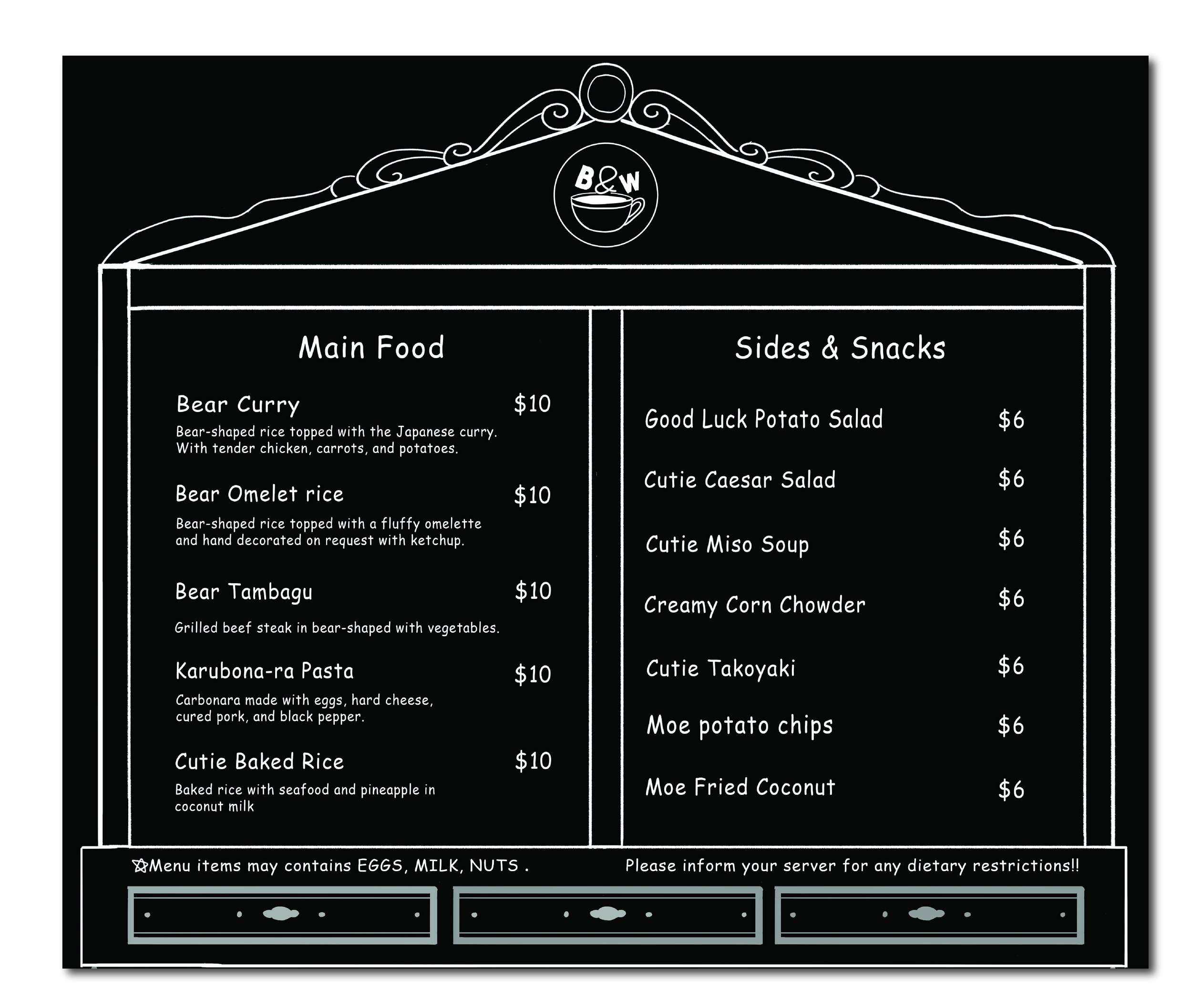
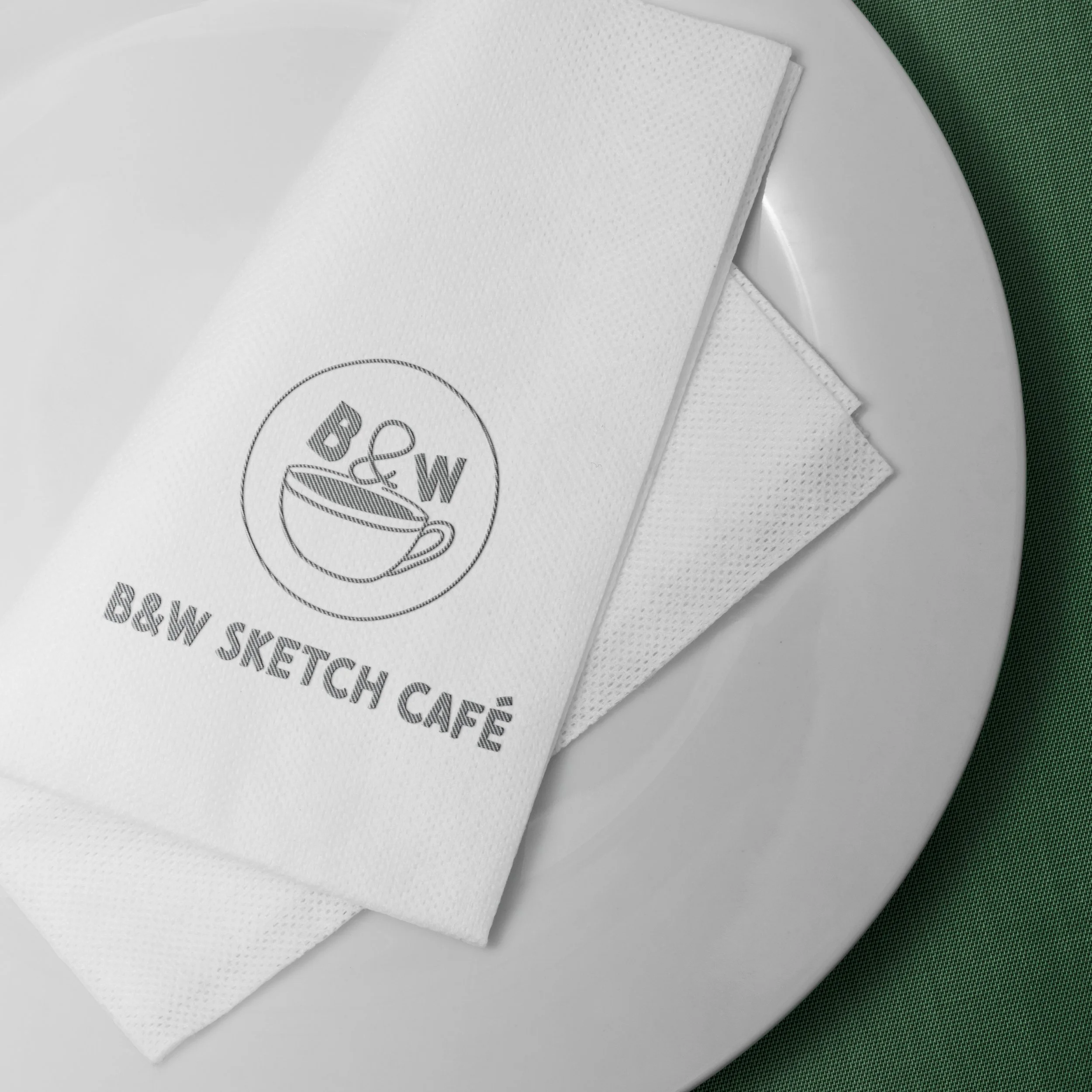
B&W Sketch Café
Self Project:
This project was a typography assignment required us to design a menu for any restaurants. I inspired by the 2D cafés in Japan, I conducted extensive research and gathered visual references. The signature elements of these cafés are black-and-white hand-drawn line illustrations, which became the foundation of my design direction.
The brand slogan I created is
"A Sketchy World, A Steady Cup."
It reflects the idea that in a vibrant and chaotic world full of colors, there's always a quiet place drawn in black and white just for you.


Year
03/2025
Lee’s Kitchen
Client Requirement:
The client asking for design the 3 Coroplast boards, she want to display on the wall, and design one A Frame to put on the front of store.
The client requested to highlight the unique features of her products.
The store's logo was provided by the client, so I selected deep red and light yellow as the primary colors based on the logo's color scheme and the type of dishes she offers. The design follows a retro style inspired by Chinese posters from the 1980s. emphasizing that this is a Chinese specialty restaurant in Seattle.
Year
01/2024


Ten Seconds
Client Requirement:
The client requested designs for a gift card, menu, window stickers.
They requested images of Yunnan's landscapes or a traditional Chinese painting style to highlight that their product is Yunnan Cross-Bridge Rice Noodles. Their logo is designed with Chinese calligraphy, so it naturally follows the Chinese classical style. I chose a Chinese ink wash painting theme, using light gray and ink black as the main colors to complement the overall aesthetic of their logo.
Year
12/2024


NaiGe
Client Requirement:
The client requested a gift card and menu design with orange as the primary color. Since the main color was specified by the client, I incorporated a combination of orange, white, and black to balance the overall color scheme. This ensures a visually appealing and harmonious design while maintaining a strong brand identity.
Year
12/2024


Doll Warrior
Client Requirement:
This project was quite challenging because the client’s logo design did not match the restaurant’s interior style at all. On top of that, the logo colors—bright yellow and hot pink—were unusual, making the logo less clear and noticeable.
Even though I had different design preferences, I respected the client’s choices and worked with what was given. I used bright yellow as the main color, hot pink for the text, and kept the green from the logo, even though I didn’t think it was the best fit.
When my design thoughts didn’t align with the client’s, I still made sure to follow their requirement and create the best design to satisfied my customers.
Year
11/2024


Health Care
Client Requirement:
This project involved designing business cards and promotional pages for a health supplement company. The client requested a design that matches their logo’s color scheme, so I chose green, orange, and white as the main colors.
The focus of this project was on content and product layout, making the information clear and visually appealing. It was a challenging yet rewarding design process.
Year
10/2023


Illustration for Chinese Gaming Company
Here are some projects for a Chinese gaming companion company that hired me as an illustrator to create custom character nameplates exclusively for their VIP clients.

Year
07/2022


Realty Sign Design
Client Requirement
This project was a sign design for a real estate agent. The client provided their company logo and details and requested a black and gold color scheme to create a high-end, luxurious look.
I focused on a sleek and elegant design, ensuring the signage stands out while maintaining a professional and upscale feel.
Year
07/2023


Bally Market
Client Requirement :
This project was for a newly opened supermarket that needed a promotional flyer to attract customers. The client asked me to select product images and highlight special discount prices.
I chose a green background to create a fresh and natural feel, and added small decorative elements at the top to emphasize that this is a supermarket. I carefully selected fresh-looking products to make the flyer more appealing and inviting, ensuring that customers perceive the store’s fruits and vegetables as high-quality and fresh.
